AI Room Color Palette Generator: What to Use Instead
Searching for an AI room color palette generator? See why a full room redesign works better, and try it free on your own room at RoomRefresh.ai.
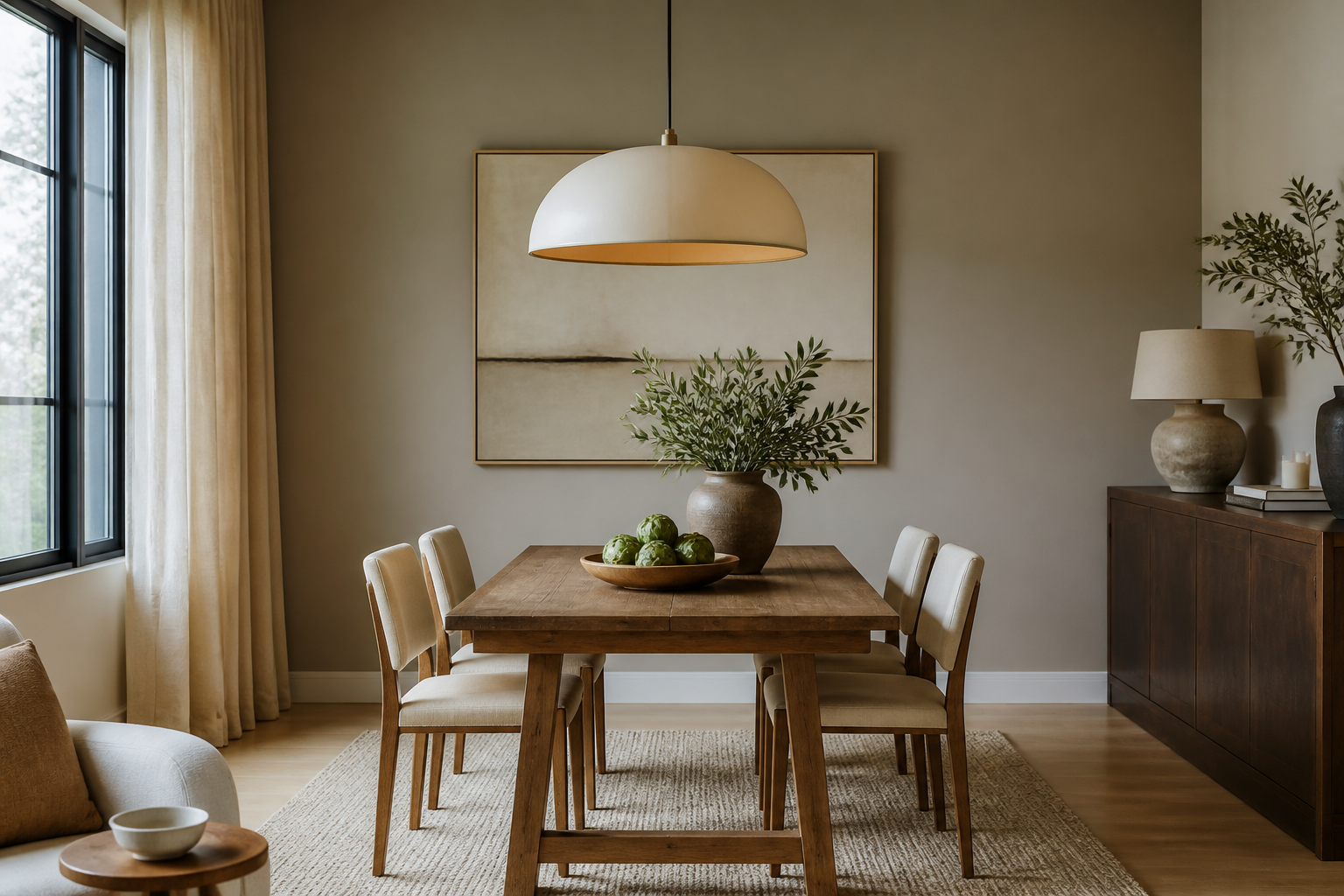
AI Room Color Palette Generator: Why a Full Room Redesign Beats a Swatch List
You typed "ai room color palette generator" into a search bar because you're standing in your living room holding three paint chips and none of them are telling you what you actually need to know: how that color will sit next to the couch you already own, under the light that actually comes through your windows, at 3pm on a Tuesday. A palette generator gives you five hex codes and a gradient bar. It does not tell you whether that greige will fight with your oak floor or whether your mustard chair is about to look orphaned against a cool gray wall.
What a palette tool can't show you
Standalone color-palette generators work from theory, not from your room. You feed them a mood or a base color and they return a swatch strip built on color-wheel rules: complementary, analogous, triadic. That's useful for a logo. It's close to useless for a room, because a room isn't five flat squares, it's a floor with an undertone, a window with a light temperature, and furniture you're not replacing. A color that reads as "warm neutral" on a swatch card can read sallow or muddy the second it's next to your specific flooring.
This is also why RoomRefresh.ai doesn't offer a standalone palette generator as a separate tool. The palette isn't the product. A full redesign of your actual room, generated from a photo you upload, is the product, and the palette comes out of that process already tested against your walls, your light, and your furniture instead of floating free of them.
The mistake almost everyone makes with a swatch card
The most common color mistake isn't picking an ugly color. It's picking a color in isolation and only discovering the clash once two gallons are already on the wall. A cool, blue-leaning white looks crisp on a paint chip under fluorescent store light. Bring it home to a room with honey-toned oak floors and north-facing windows, and it turns flat and slightly clinical, fighting the warmth already on the ground instead of working with it. The floor was always the loudest color decision in the room. Most people never test the wall color against it before buying.
Undertone cheat sheet: what's safe against your floor
Floors are permanent in a way paint isn't, so they should set the rules. Here's a rough guide for matching wall undertones to common flooring you'll find in rentals and older homes.
| Floor undertone | Where you'll see it | Safer wall undertones | Riskier wall undertones |
|---|---|---|---|
| Honey / golden oak | Common in older hardwood and much builder-grade LVT flooring | Warm greige, oat, soft clay | Cool blue-gray, stark white |
| Gray-brown / "driftwood" | Common in newer engineered wood and vinyl plank | Cool white, sage, dusty blue | Warm yellow-beige |
| Red-orange / cherry | Common in 1990s-2000s hardwood | Deep green, warm terracotta, ink navy | Pastel pink, cool lavender |
| Cool concrete / polished gray | Common in lofts and industrial conversions | Charcoal, warm white, muted ochre | Baby blue, cool mint |
If you don't know your floor's undertone by name, look at it in direct daylight, not lamp light. Golden and orange undertones lean warm. Pink and blue-gray undertones lean cool. Match your wall to that lean and you've already avoided the most common wall-color regret.
What a full-room redesign gets right that a palette can't
Say your living room has cool, slightly gray-beige rental walls and a mustard boucle chair that currently reads as the only spot of color in the room. A palette generator would hand you five colors that pair nicely with mustard on a color wheel. A full room redesign works differently: it looks at everything already in the frame, the chair, the floor, the light coming through the window, and proposes a wall tone and small accents that pull those existing pieces into one coherent room instead of leaving the chair to stand alone. That's the real difference between a palette and a room. A palette is generated in isolation. A room-aware redesign is generated from what's actually there.
How to actually use this on your own room
Upload one photo of your living room, the one with the chair you're not replacing and the light your windows actually let in, then pick a style from options like Japandi, modern farmhouse, or minimalist. RoomRefresh.ai returns four photorealistic redesigns built from your room's real proportions and layout, each with a shopping list linking to the pieces shown. You're not choosing a color in a vacuum. You're seeing four full, coherent versions of your specific room and picking the one that already looks right before you buy a drop of paint.
Start on the free tier to see your room reimagined in a couple of styles, then upgrade if you want unlimited renders, high-res exports, and the full shopping list. Try it on your own room at RoomRefresh.ai before you commit to anything at the paint counter.
If you're set on doing it yourself anyway
Buy a sample pot, not a chip. Paint a 12x12 inch square directly on the wall you're changing, not on poster board, and look at it morning, midday, and evening. Do this before you touch trim or ceiling colors, since a wall that reads warm at noon can read muddy under a 2700K lamp at night. If you're renting and can't paint at all, the undertone logic still applies to rugs, curtains, and throw pillows, which is where a low-cost swap strategy does most of the same work paint would.
Where this leaves the search for a palette generator
If you came here looking for a tool that spits out hex codes, that's not what RoomRefresh.ai does, and it's worth saying plainly: there's no standalone color-palette feature here. What exists instead is a way to see your actual room, with its actual furniture and actual light, restyled four different ways with a palette baked into each one. For anyone comparing how different platforms handle this, it's worth looking at how tools that bundle a shopping list differ from ones that only hand you a moodboard, and how photorealism varies across the current crop of AI room design apps. If your next room is a living room and you're drawn to a calmer, more considered palette overall, the anchor-piece approach in a Japandi refresh is a good place to see how a full palette gets built around just a few pieces instead of five paint chips.